Thursday, April 26, 2012

C2E2 2012

Thank you to everyone who came out to the Chicago Comic and Entertainment Expo this year! Your support of Floppets and The Guild has super charged our engines, and we have taken the inspiration you gave us last weekend focused it into new projects and products we will be sharing with you soon!


Photo 1: If you didn't make it to C2E2, and were curious as to the end result of my Copic Marker process to create Think Tink, this is what the final prints looked like. Amy Okuda and I were overjoyed by the fact that they sold out within the first few hours, but it may make you sad to know that I will hold true to my C2E2 promise, and never issue that print again.


Photo 2: Right now you may be making this same face! Turns out Amy is not a big fan of flying! Luckily, Chicago is only a...5...hour..flight... Well, look on the bright side! It's closer than New Zealand!


Photo 3: The flight flew by, uh, literally, and before we knew it, we had arrived! The show was huge, and very cosplay oriented. Everywhere we looked, there were super heroes, villains, monsters, and living cartoon characters. At one point, somebody pointed at Amy as we passed by and said, "That girl is dressed as Tink!"


Photo 4: Floppets! scored with a booth right across from Marvel, in the main center isle. Here's a shot of it being set up in the early morning calm before the storm. Our main goal for the show, as you can see, was to promote Guild Floppets.


Photo 5: It didn't take long for the crowd to gather. We had a consistent line of fans for over 5 hours on Saturday! Amy signed headshots, comics, and dvds, and I offered the exclusive print free with the purchase of a full set of Guild Floppets. We both signed every print, and Amy personalized them, being sure to get the proper spelling of every name, since we came across so many unusual versions! It kept us on our toes. All in all, it was around 1,000 autographs for the weekend! That is a lot of awesome fans!


Photo 6: And so many of them in cosplay. My favorite, hands down, was Zaboo! I've seen lots of Guild costumes, but this was a first for me. Seeing this guy dressed as the "real world" Zaboo made me realize the impact Felicia Day, Sandeep Parikh, and the cast have on fans. It's the dream all entertainers dream...


Photo 7: Another super impressive fan proudly showed off his Table Top shirt! The new Geek & Sundry show, created and starring Guild alum Wil Wheaton, had only premiered the previous week. How did this guy get a shirt already!!! It's fans like this that keep us in the game!


Photo 8: And no con is complete without an Adam West Batman. Although, after listening to his conversation with Amy, I'm not certain that this is NOT Adam West himself!!!


Photo 9: Geedom has changed so much since the days when I was a lonely outcast! These ARE the droids I'm looking for!!!


Photo 10: Best of Show has to go to Godzilla, though. This costume was incredibly impressive, and, having done some suit performing myself, I have to give full credit to anyone who can endure wearing a giant foam costume around a con all day!


Photo 11: After the show closed on Saturday, the Floppets Gang took us out for a fancy dinner on the river. My Floppets partners are Chicago locals, so they were able to show us some great sights in our limited time in the Windy City. This photo was our view during dinner. I took several of my own pics, but I decided to use this one that Amy took because when she posted it on Twitter, someone commented that they thought they saw an Ewok in the lower right corner. I can't argue otherwise...


Photo 12: I scratched up a handful of Think Tink prints for the show on Sunday. We reserved a stack for our Floppets employees and biggest costumers, not realizing they would be so popular at the show. But fans come first, so the whole run went to people at C2E2. We signed for 4 hours before we had to head off to O'hare to catch our flight back to LA. It was a short trip, but it was nice to have some time hanging out with Amy.


Photo 13: Before leaving the con, I made some time to do a few things: First, I did a quick interview with Pixeldom, who were conducting a live stream from the con. We talked about Floppets, the Guild, and the entertainment industry in general. They asked me for advice for young filmmakers, and I said...well, this: pixeldom.com


Photo 14: And lastly, it is impossible for me to escape my number one addiction at a con: shopping! And what better person to shop with than Amy. She makes no secret of the fact that not everything geek interests her, so in a sea of SpiderMan t-shirts and Star Wars plush, it was refreshing to find a meld of fashion and nerd. I got this pink angel-winged raincoat for Amy as a thank you gift for her support of my new company. She loved it because it was pink. I loved it because it reminded me of Zhora's coat in Blade Runner. This photo is Amy saying, "Uh, yeah, sure. AND its PINK!"


Photo 15: On the way to the airport, there was just enough time for some Chicago style pizza. We went to a renowned joint called Gino's. Of course, we had to get the traditional Chicago deep dish pizza. After a full day of comiconning, we were STARVING!


Photo 16: Since the one common factory in all my travels seems to be pizza, I might as well stay consistent and explain the differences in case you have never had the opportunity to partake in Chicago deep dish pizza. First, it is cooked in pans, not on trays. The pans are about 2" deep, so the crust ends up standing pretty high, and the toppings are layered in much thicker. The real difference from New York style pizza is that the cheese goes on FIRST, with the sauce on top. The theory is that the hot sauce blanket keeps the pizza warmer longer. Believe it or not, half of this pie has pepperoni! Yes, even the "toppings" go in the middle! Does that still make them toppings!?!


Photo 17: So that was C2E2! It was a great show, with a great turnout. Floppets were met with an overwhelmingly positive response all weekend, and we had the added bonus of discovering that Sunday was "Kids Day", which gave us a whole new audience. I met lots of Labou fans, and almost every kid was sporting swag from their favorite franchise. This Pokemon fan is the real deal, and my dream for Floppets is that someday we can have legions of loyal fans like this! You can help me make that happen by commenting below, tweeting about your favorite Floppets, liking our facebook page, and wearing your Floppets proudly! We appreciate your support and promise to keep making more things you love!


Wednesday, April 11, 2012

Think Tink

This weekend is C2E2, or Chicago Comic and Entertainment Expo, if you didn't know! It's a huge show, and I am excited to attend, representing Floppets!


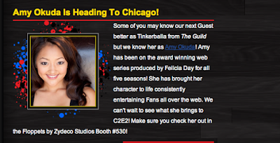
We will be doing a big push for The Guild Floppets, and I am thrilled that Amy Okuda will be joining me to promote them.

Since we will both be at the show, I thought it would be fun to do an exclusive piece of art that we can sign for fans when they come for their Guild Floppets. And what better subject matter to draw than Amy as Tink...

Photo 1: I know, another blog about a Guild project. Shocking! Well, it's an awesome show, and they are my friends, and I have yet to hear anyone say to me that they are sick of Guild projects! And guys, c'mon! AMY OKUDA!

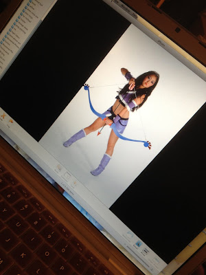
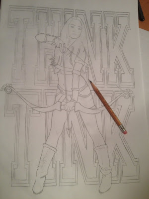
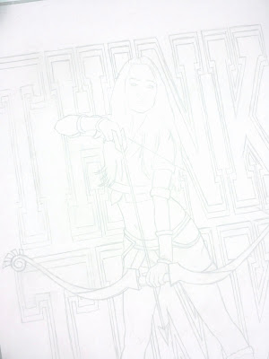
Photo 2: I picked my favorite photo from the DATE MY AVATAR photoshoot, and did a quick pencil sketch of it. I thought it would be cool to put the words THINK TINK behind her, hence the name of this blog. I did them in classic college font, like the Victoria's Secrets Think Pink campaign. The drawing is a rough guideline, so I wasn't worried about keeping it too clean and straight. I also didn't do any shading, since I planned on doing it in Copic Markers and didn't want the pencil to dictate any tone.

Photo 3: Even though I am old school and actually still use things like markers and paint, I have found a few life saving advantages of the digital age. One useful technique is scanning the original pencil and markering on a printout. That way, if I really mess it up (it happens!) I don't have to completely redraw it. I usually lighten the pencils in photoshop, too, so that they are just ghost lines on the paper. This helps them disappear in the final art. I print it on standard bond, because I like how the markers react to it best.

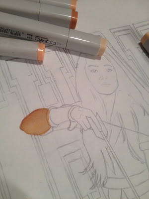
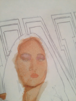
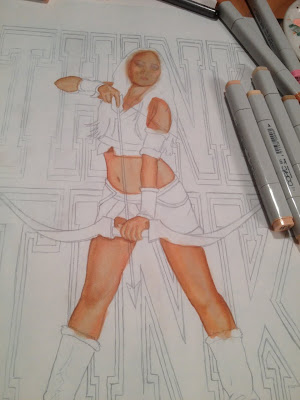
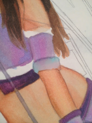
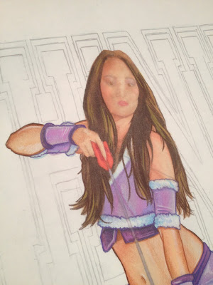
Photo 4: When I am doing a painting in acrylic or oil, I ALWAYS start with the furthest plain back and work forward. With marker, it doesn't really matter. So, I usually start with the face, because if you are going to botch up a piece of art anywhere, it's usually going to be on the face of the subject. My philosophy is that, if I get the face correct, the rest will be smooth sailing. Tonite, I was pretty tired getting started, and felt like I needed some warm up before I dove that deep, so the elbow seemed appealing!

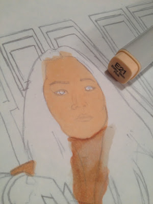
Photo 5: And then I stalled a little more with the neck. But ultimately I had to get to the face. Markers work a lot like watercolor, and the Copics have beautiful blending properties. I usually start with a middle tone base color.

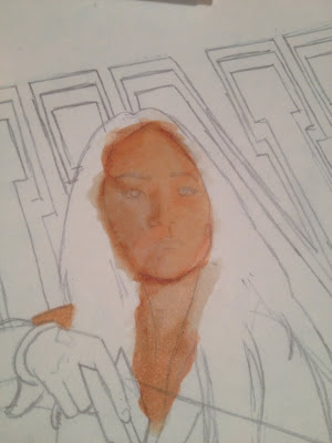
Photo 6: Then I build up some shadows, hitting the whole area with the base color again to blend the shadows in a bit.

Photo 7: And then I take advantage of the Copic's ability to "erase" by using a lighter tone, or sometimes the colorless blender, and draw out some of the color to create highlights.

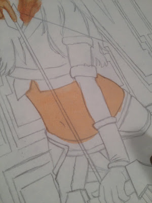
Photo 7: I was moving pretty quick on this, and kept forgetting to take comprehensive photos of every step, so hopefully this torso section will explain what I mean better. Step one, middle tone base color.

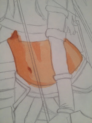
Photo 8: Step two, shadows. You can see the various degrees of shading I've added. At this point, I don't even worry about soft edges or blending, just blocking in the tones.

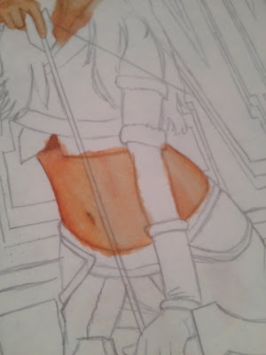
Photo 9: Step three, blending. Here I used the lightest skin tone I had. I find that using lighter tones often provides better results than the colorless blender, especially when you want to keep the area saturated. You can control how much of the shadow color stays by how much or how little you work the lighter marker over it.

Photo 10: Here is Amy with all her skin tones blocked in. Is it me, or am I saying "tones" a lot!?!

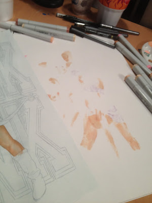
Photo 11: The blending and color lifting abilities of these markers are the greatest things ever, but you do need to be careful. You are essentially flooding your paper with excess ink, and it needs to go somewhere! If you are working directly on the surface of your desk, it will most likely collect, and cause bleeding, or smear and bleed through your art as you move it. I work on a stack of blank paper, and every couple areas I color, I pull the top sheet out to keep a clean working surface.
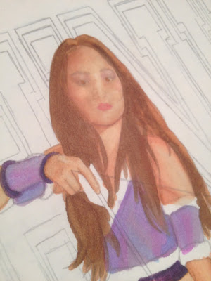
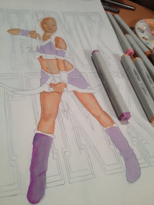
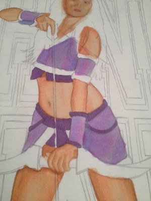
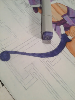
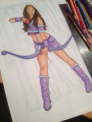
Photo 12: Next is the purple! Same process, middle base, shadows, highlight blending.
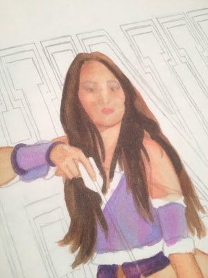
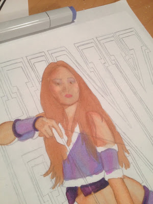
Photo 13: The regular household printing paper really absorbs the marker color, and also freely lets it go with the blending and erasing techniques, unlike illustration board or hot press bristol. But it is that same paper property that allows the ink to bleed so easily. I try to control it as much as possible, but often you just have to let it go. I'll show you what I do about it in a few.

Photo 14: If you've never used alcohol based markers before, definitely experiment some before working on an important piece. Different combinations actually provide different results. For instance, light tones (tones!) over dark will often create a grainy texture, while building up shadows over highlights will lay down smooth. Both are interesting and effective, you just need to plan what you want where ahead of time.

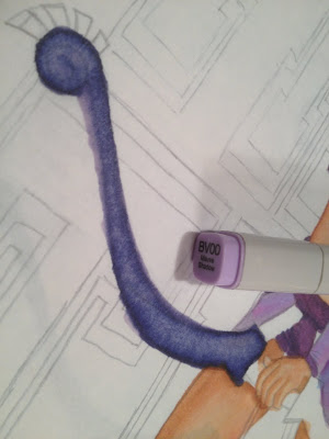
Photo 15: Here's what the light lilac did going over the darker blue berry. I focused the stroke in the middle, so the edges stayed darker. Notice the grain I mentioned.


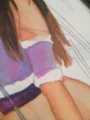
Photo 16: And I'm sure you noticed the excessive bleed! Trying to pull back on a really dark color takes a lot of lighter ink, so it's important to remember to shift the paper under your art so the excess being drawn out doesn't pool and absorb back up into your art! And, I know it's a waste of paper, but throw that layer out after this. The same way that these markers lift and blend colors on your art sheet, they can revive and lift colors up from the work surface underneath back into your art. You don't want to forget that the dark purple stain is under there, start working on the face, and have it bleed through!

Photo 17: Back to Amy. So the bow was dark to light, here I am going light to dark, to get a softer blend for the hair.

Photo 18: Middle tone (TONE!!!)

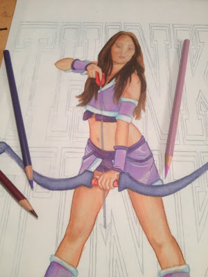
Photo 19: And then the darkest. Still missing something, you say? I'm going to finish the piece in Prismacolor Pencils! The markers are just the base.

Photo 20: So...about that bleed...

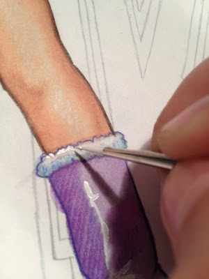
Photo 21: I used some neutral grays, blended with some cool blue to "eat" the bleed away. Normally I would try to leave some white surface, but these areas are too small, so I'll deal with that later. Be careful not to over saturate the area when fighting back the bleed, because you will end up reversing the situation and bleed back into the previous color.

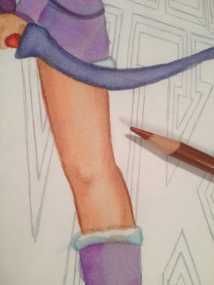
Photo 22: With all of the marker laid in, it was time to move onto pencils. I started again with the flesh tones (dammit). As I am forever a slave in attempting to emulate my most favorite artist in the history of art, Drew Struzan, I chose to outline Amy with darker pencil lines. I didn't blend them into the shadows, they just stay as stylized pencil lines. I used burnt sienna around her flesh t.... I give up.

Photo 23: The same process for the rest of Amy, finding a suiting outline color to correspond with each area.

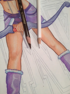
Photo 24: Some of the areas needed more pop, so I went in with a secondary, darker, outline. I also started adding highlights with a white pencil.

Photo 25: Highlights in the hair.

Photo 26: OK, all of the outlining is done, and I've procrastinated enough. And, I'm not getting any not tireder. See!?! Time for the face.

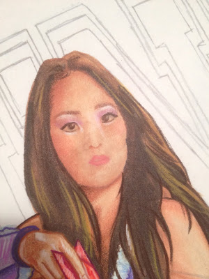
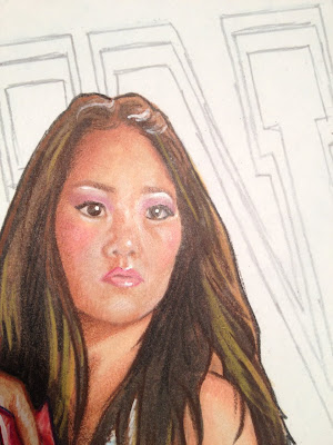
Photo 27: I always start with the eyes, as they are the "make or break" feature. I don't know why I am showing you THIS picture. Right now, we are leaning towards the "break" side of things. I need more pencil movement...

Photo 28: Alright, that's better. Looks much more like Amy. Or, Tink, at least.

Photo 29: Using white acrylic, I put back some of the highlights that got markered over earlier.

Photo 30: I also use the acrylic to brighten the whites of her eyes, and pop in a few more highlights.

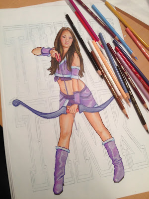
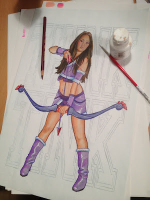
Photo 31: Add in the arrow and the bow string, and Tink is finished. Now all I have to do tonite is color the background. And write this blog...

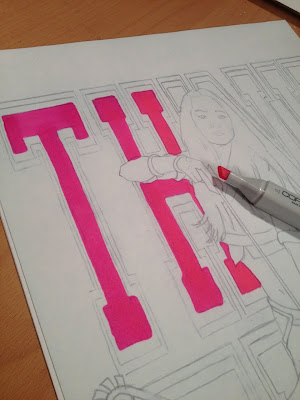
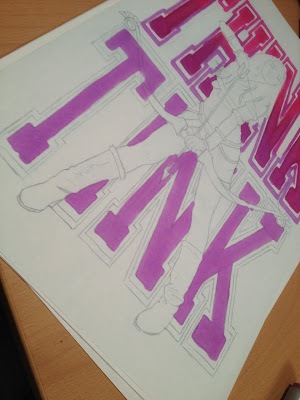
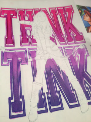
Photo 32: Ordinarily, I like to keep my art "live", meaning, as one whole, continous piece so the final art is a complete original. Looks better in a frame that way. But it was right after I finished Tink that I decided I wanted to blog about this art BEFORE I got to C2E2, which meant I had to do it tonite (or last night, probably, by the time you read this) because I have a few other projects due before I leave on Friday. So knowing that it would take a few hours to blog, I had to decide on the best way to get the art done quickly. Coloring the lettering around the figure is totally possible, but I would have to take my time to not mess it up! So, despite my instincts, I chose to go digital once again. Well, digitally assisted, any way. I printed out another line art, and based out the letters on a second sheet.

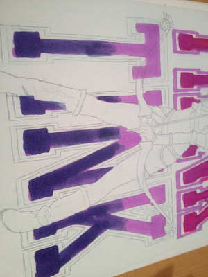
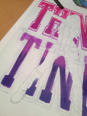
Photo 33: I used a few different shades to create a gradation. At this point you are probably wondering why I did just do the whole background in photoshop, right? Well, I still wanted it to be a hand drawn illustration, and in my mind, comping two hand drawn elements to make a finished product is an acceptable cheat.

Photo 34: Same principles as with the figure: Middle t...shade.

Photo 35: Darker...color.

Photo 36: Then blended with a lighter... hue.

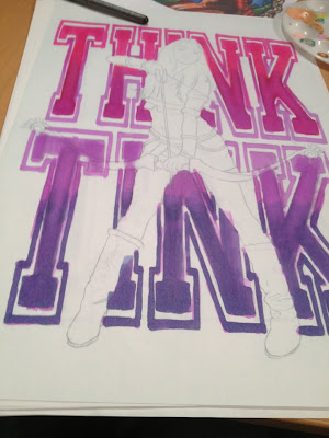
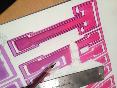
Photo 37: I repeated the same for the font outline. With the nerve wrecking concern of having to work around Tink gone, I was able to marker these letters fast and loose. I didn't have to worry about bleed, which gave me better, and more importantly, faster, blends.

Photo 38: Back to the pencil. When I was a kid painting signs in Manhattan, I would strive to make my hand lettering look like a machine. Now, with every font available to eveybody at a click of a button, I actually try to make sure the lettering in my art reads as hand done. Hand done? Can you say that? Am I sounding ignorant by trying to save a single word and not saying "done by hand"??? But you know what I meant.

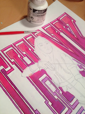
Photo 39: Everything is outlined, some with a ruler, some freehand. Now to clean up that bleed.

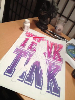
Photo 40: Really, I don't hate the computer. I just like to keep my digital art and my "analog" art separate. I know I could select and delete the bleed from the digital file after I scan this, but it just seemed more natural to me to clean it up with some acrylic and a brush.

Photo 41: Think Tink is ready to be scanned, comped, and printed for C2E2! You'll have to wait till the show to see what the final looks like! Don't worry, that's only like 30 some odd hours away! Come check it out and say hi to Amy and I at booth #530.

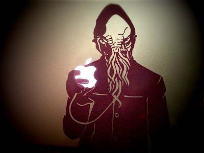
Photo 42: And if you can't make it to Chicago, don't despair. Tink wasn't the only piece of art I did this week that you can get your hands on. I've been messing around with some Mac skins as a "decompressing" ritual from the massive new show I just filmed with Sandeep Parikh. Hopefully I can talk about that soon. In the mean time, if you are a fan of the Doctor, check out my Ood...

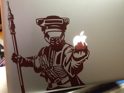
Photo 43: And, because I can't go a single day without thinking about Star Wars, here's a Boushh. You can find both of these designs at my etsy shop! Check back often, I'll be posting more designs as I get them done between projects.