This weekend is C2E2, or Chicago Comic and Entertainment Expo, if you didn't know! It's a huge show, and I am excited to attend, representing Floppets!
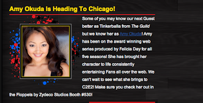
We will be doing a big push for The Guild Floppets, and I am thrilled that Amy Okuda will be joining me to promote them.
 Since we will both be at the show, I thought it would be fun to do an exclusive piece of art that we can sign for fans when they come for their Guild Floppets. And what better subject matter to draw than Amy as Tink...
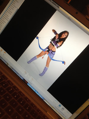 Photo 1: I know, another blog about a Guild project. Shocking! Well, it's an awesome show, and they are my friends, and I have yet to hear anyone say to me that they are sick of Guild projects! And guys, c'mon! AMY OKUDA!
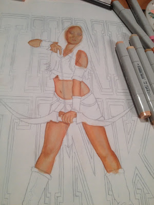
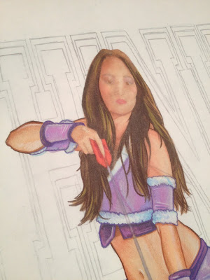
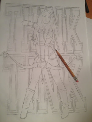 Photo 2: I picked my favorite photo from the DATE MY AVATAR photoshoot, and did a quick pencil sketch of it. I thought it would be cool to put the words THINK TINK behind her, hence the name of this blog. I did them in classic college font, like the Victoria's Secrets Think Pink campaign. The drawing is a rough guideline, so I wasn't worried about keeping it too clean and straight. I also didn't do any shading, since I planned on doing it in Copic Markers and didn't want the pencil to dictate any tone.
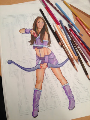
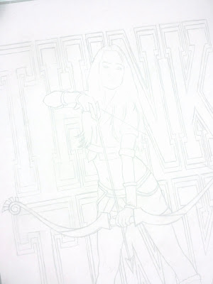 Photo 3: Even though I am old school and actually still use things like markers and paint, I have found a few life saving advantages of the digital age. One useful technique is scanning the original pencil and markering on a printout. That way, if I really mess it up (it happens!) I don't have to completely redraw it. I usually lighten the pencils in photoshop, too, so that they are just ghost lines on the paper. This helps them disappear in the final art. I print it on standard bond, because I like how the markers react to it best.
 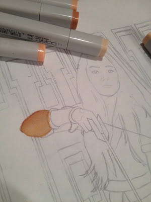 Photo 4: When I am doing a painting in acrylic or oil, I ALWAYS start with the furthest plain back and work forward. With marker, it doesn't really matter. So, I usually start with the face, because if you are going to botch up a piece of art anywhere, it's usually going to be on the face of the subject. My philosophy is that, if I get the face correct, the rest will be smooth sailing. Tonite, I was pretty tired getting started, and felt like I needed some warm up before I dove that deep, so the elbow seemed appealing!
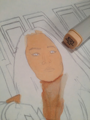 Photo 5: And then I stalled a little more with the neck. But ultimately I had to get to the face. Markers work a lot like watercolor, and the Copics have beautiful blending properties. I usually start with a middle tone base color.
 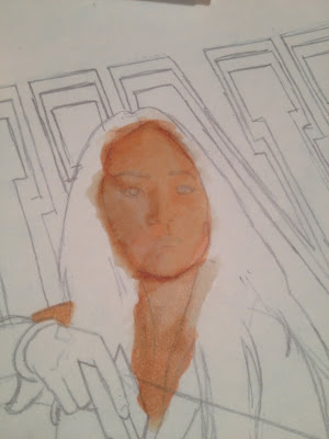 Photo 6: Then I build up some shadows, hitting the whole area with the base color again to blend the shadows in a bit.
 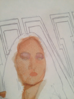 Photo 7: And then I take advantage of the Copic's ability to "erase" by using a lighter tone, or sometimes the colorless blender, and draw out some of the color to create highlights.
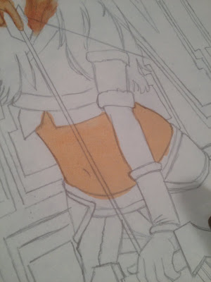 Photo 7: I was moving pretty quick on this, and kept forgetting to take comprehensive photos of every step, so hopefully this torso section will explain what I mean better. Step one, middle tone base color.
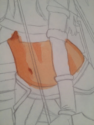 Photo 8: Step two, shadows. You can see the various degrees of shading I've added. At this point, I don't even worry about soft edges or blending, just blocking in the tones.
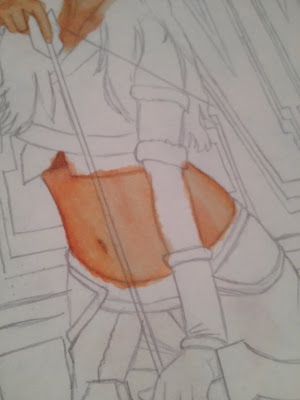 Photo 9: Step three, blending. Here I used the lightest skin tone I had. I find that using lighter tones often provides better results than the colorless blender, especially when you want to keep the area saturated. You can control how much of the shadow color stays by how much or how little you work the lighter marker over it.
 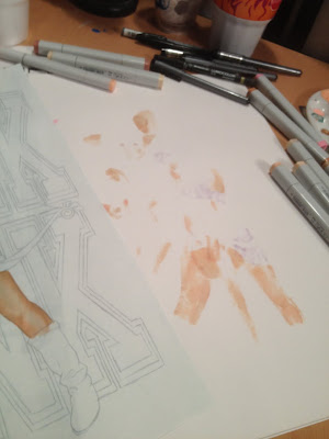 Photo 11: The blending and color lifting abilities of these markers are the greatest things ever, but you do need to be careful. You are essentially flooding your paper with excess ink, and it needs to go somewhere! If you are working directly on the surface of your desk, it will most likely collect, and cause bleeding, or smear and bleed through your art as you move it. I work on a stack of blank paper, and every couple areas I color, I pull the top sheet out to keep a clean working surface.
 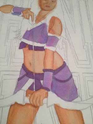 Photo 13: The regular household printing paper really absorbs the marker color, and also freely lets it go with the blending and erasing techniques, unlike illustration board or hot press bristol. But it is that same paper property that allows the ink to bleed so easily. I try to control it as much as possible, but often you just have to let it go. I'll show you what I do about it in a few.
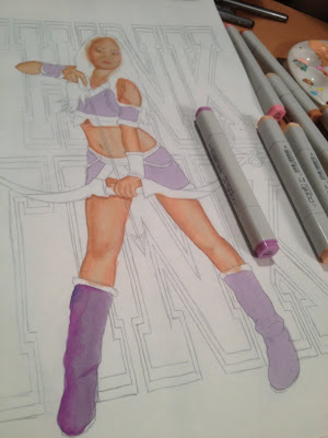
 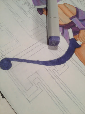 Photo 14: If you've never used alcohol based markers before, definitely experiment some before working on an important piece. Different combinations actually provide different results. For instance, light tones (tones!) over dark will often create a grainy texture, while building up shadows over highlights will lay down smooth. Both are interesting and effective, you just need to plan what you want where ahead of time.
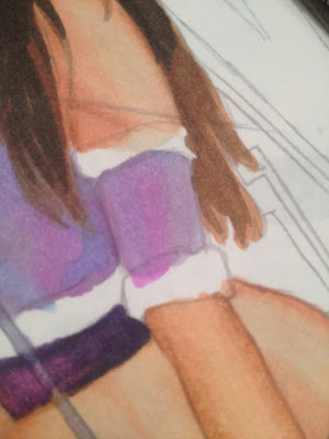
 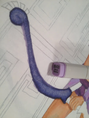 Photo 15: Here's what the light lilac did going over the darker blue berry. I focused the stroke in the middle, so the edges stayed darker. Notice the grain I mentioned.
Photo 16: And I'm sure you noticed the excessive bleed! Trying to pull back on a really dark color takes a lot of lighter ink, so it's important to remember to shift the paper under your art so the excess being drawn out doesn't pool and absorb back up into your art! And, I know it's a waste of paper, but throw that layer out after this. The same way that these markers lift and blend colors on your art sheet, they can revive and lift colors up from the work surface underneath back into your art. You don't want to forget that the dark purple stain is under there, start working on the face, and have it bleed through!
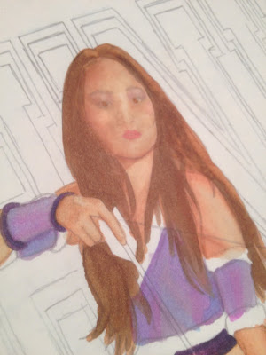
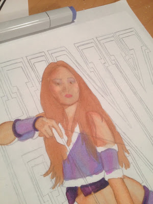 Photo 17: Back to Amy. So the bow was dark to light, here I am going light to dark, to get a softer blend for the hair.
 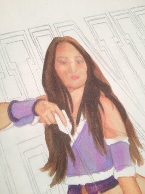 Photo 19: And then the darkest. Still missing something, you say? I'm going to finish the piece in Prismacolor Pencils
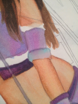 Photo 21: I used some neutral grays, blended with some cool blue to "eat" the bleed away. Normally I would try to leave some white surface, but these areas are too small, so I'll deal with that later. Be careful not to over saturate the area when fighting back the bleed, because you will end up reversing the situation and bleed back into the previous color.
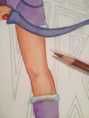 Photo 22: With all of the marker laid in, it was time to move onto pencils. I started again with the flesh tones (dammit). As I am forever a slave in attempting to emulate my most favorite artist in the history of art, Drew Struzan
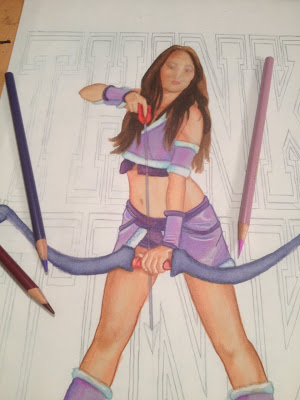 Photo 23: The same process for the rest of Amy, finding a suiting outline color to correspond with each area.
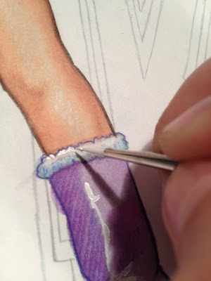
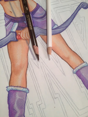 Photo 24: Some of the areas needed more pop, so I went in with a secondary, darker, outline. I also started adding highlights with a white pencil.
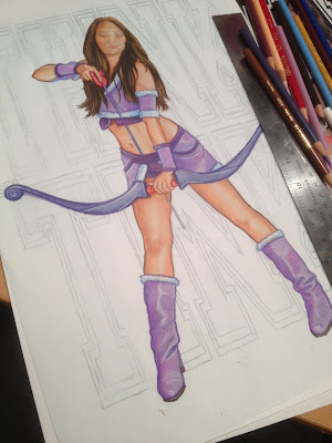 Photo 26: OK, all of the outlining is done, and I've procrastinated enough. And, I'm not getting any not tireder. See!?! Time for the face.
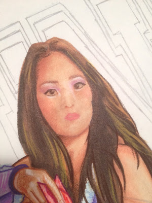 Photo 27: I always start with the eyes, as they are the "make or break" feature. I don't know why I am showing you THIS picture. Right now, we are leaning towards the "break" side of things. I need more pencil movement...
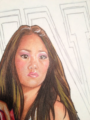 Photo 30: I also use the acrylic to brighten the whites of her eyes, and pop in a few more highlights.
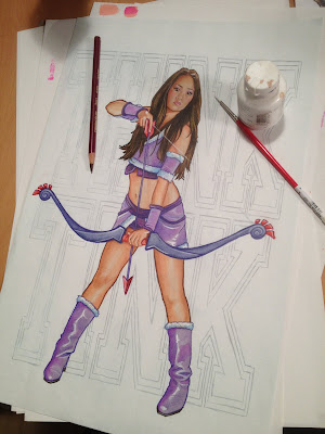 Photo 31: Add in the arrow and the bow string, and Tink is finished. Now all I have to do tonite is color the background. And write this blog...
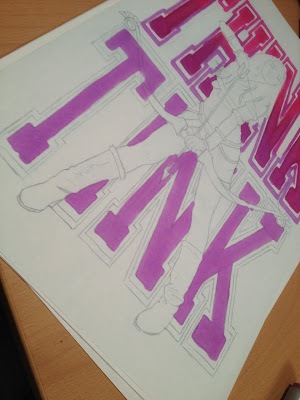
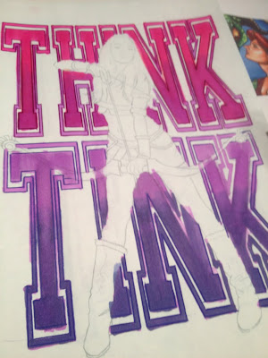
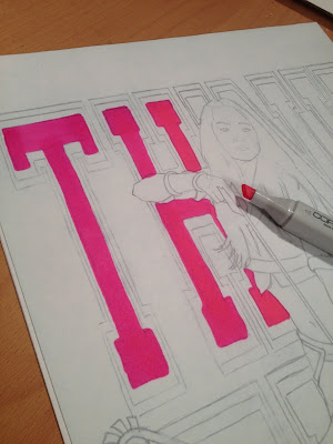 Photo 32: Ordinarily, I like to keep my art "live", meaning, as one whole, continous piece so the final art is a complete original. Looks better in a frame that way. But it was right after I finished Tink that I decided I wanted to blog about this art BEFORE I got to C2E2, which meant I had to do it tonite (or last night, probably, by the time you read this) because I have a few other projects due before I leave on Friday. So knowing that it would take a few hours to blog, I had to decide on the best way to get the art done quickly. Coloring the lettering around the figure is totally possible, but I would have to take my time to not mess it up! So, despite my instincts, I chose to go digital once again. Well, digitally assisted, any way. I printed out another line art, and based out the letters on a second sheet.
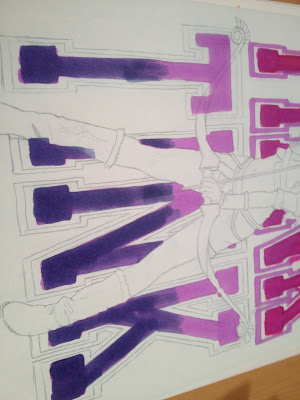
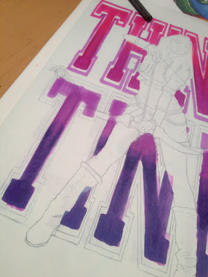
 Photo 33: I used a few different shades to create a gradation. At this point you are probably wondering why I did just do the whole background in photoshop, right? Well, I still wanted it to be a hand drawn illustration, and in my mind, comping two hand drawn elements to make a finished product is an acceptable cheat.
 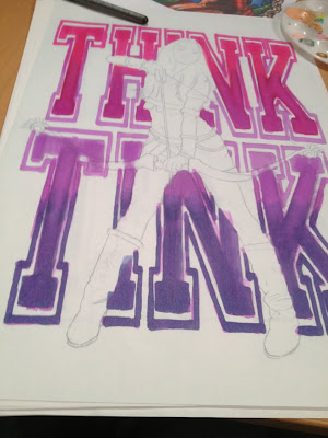 Photo 37: I repeated the same for the font outline. With the nerve wrecking concern of having to work around Tink gone, I was able to marker these letters fast and loose. I didn't have to worry about bleed, which gave me better, and more importantly, faster, blends.
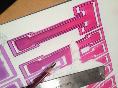 Photo 38: Back to the pencil. When I was a kid painting signs in Manhattan, I would strive to make my hand lettering look like a machine. Now, with every font available to eveybody at a click of a button, I actually try to make sure the lettering in my art reads as hand done. Hand done? Can you say that? Am I sounding ignorant by trying to save a single word and not saying "done by hand"??? But you know what I meant.
 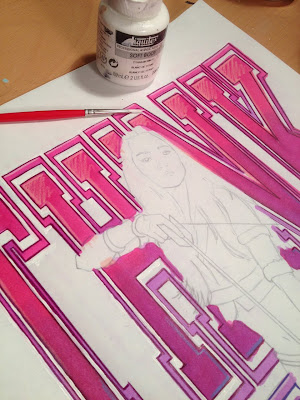 Photo 40: Really, I don't hate the computer. I just like to keep my digital art and my "analog" art separate. I know I could select and delete the bleed from the digital file after I scan this, but it just seemed more natural to me to clean it up with some acrylic and a brush.
 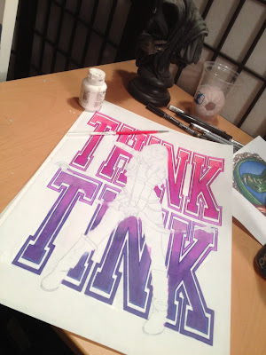 Photo 41: Think Tink is ready to be scanned, comped, and printed for C2E2! You'll have to wait till the show to see what the final looks like! Don't worry, that's only like 30 some odd hours away! Come check it out and say hi to Amy and I at booth #530.
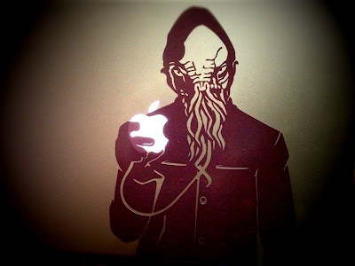 Photo 42: And if you can't make it to Chicago, don't despair. Tink wasn't the only piece of art I did this week that you can get your hands on. I've been messing around with some Mac skins as a "decompressing" ritual from the massive new show I just filmed with Sandeep Parikh. Hopefully I can talk about that soon. In the mean time, if you are a fan of the Doctor, check out my Ood...
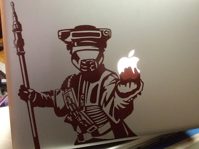 Photo 43: And, because I can't go a single day without thinking about Star Wars, here's a Boushh. You can find both of these designs at my etsy shop! Check back often, I'll be posting more designs as I get them done between projects.
It's so fun seeing your markering process. I might just have to break out my old neglected Copics and play around with trying some of your techniques.
ReplyDeleteLooking forward to seeing the final compilation! As always - your work is gorgeous.
My mind is blown- I had no idea that kind of blending was even possible with markers. Makes me think back at a lot of work that I'd assumed was done either digitally or with watercolors. I guess I'm going to have to pick up some Copics now...
ReplyDeleteGreg, great seeing you this weekend. Thanks for the Labou floppets and signing my SPD dvd!
ReplyDelete